
Redesigning Clinical Workflows for a Mental Health Platform
16th July, 2025
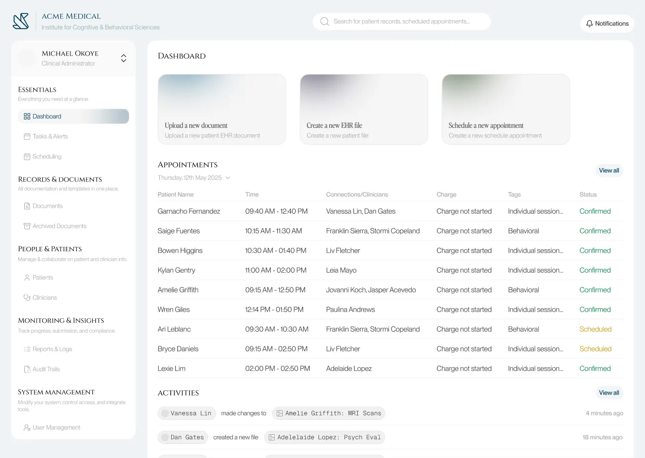
0.1 Before and after shots of the Dashboard & Documents page


Overview
I worked with a developer to redesign the document management system for a mental health clinic. Using recorded CEO interviews and PRD files, I audited existing workflows, identified friction points across both staff and patient journeys, restructured the information architecture, and delivered high-fidelity prototypes with full developer hand-off specs.
My goals going in:
Reduce the time and cognitive load required to retrieve patient documents and records.
Consolidate and simplify frequent admin workflows: patient logging, appointment scheduling, document management.
Modernize the interface to lower error rates and make new staff onboarding significantly faster.
The process here was the point: taking secondhand research, extracting structured design problems from it, and producing solutions a developer could actually build.
The existing platform had a lot of complexity without poor structure. Based on the interview recordings and dev notes, I noticed four recurring failure patterns:
Document retrieval required exact keyword matches and was unnecessarily case sensitive. Without the functionality to stack filters, staff who didn't remember precise file names usually got stuck.
Core admin workflows (logging a patient, booking an appointment, retrieving a document) involved redundant steps and unintuitive screen hierarchies.
Inconsistent UI patterns across modules meant new staff had no reliable mental model to transfer between sections, extending onboarding time unnecessarily.
Poor information hierarchy produced frequent missed and duplicated actions, particularly in scheduling.
Problem Statement
Framing The Challenge
I started by going through the interview recordings and PRDs systematically, not looking for surface complaints but for the underlying workflow UX that those complaints pointed to. The recurring frustrations fell into three clusters: slow and unreliable document retrieval, scheduling errors caused by insufficient conflict visibility, and inconsistent labelling that made the interface unlearnable across sessions.
From this, I defined two user types with distinct needs:
Admin Staff (power users): High task frequency, switching between modules constantly, need fast retrieval and minimal navigation overhead. For them, every extra click is a cognitive tax in an already high-load environment.
Patients (low-frequency users): Occasional access to their own records and appointments, low technical literacy. The interface needs to feel like a consumer product, not a clinical database.
These two profiles pulled in different directions on almost every design decision. That tension became the central constraint I designed against throughout the project.
Exploring Possibilities
Before starting on the UI design I ideated solutions for the user experience failure points.
Document Retrieval: The keyword-only search was the biggest pain point for admin staff. I explored two design directions: a natural language search bar (staff would use queries like "Find Ngozi's consent form from July") and a conventional structured multi-filter system (file type, date range, visibility setting, patient name).
Natural language search was the more ambitious option and the one I designed and prototyped first. In evaluation with the developer it failed on two fronts:
Firstly it required complex backend logic and the staffs overall trust in search results could be fragile. Ultimately it was a low trust, over-engineered solution for an internal too, so I replaced it with the multi-filter search., it was faster to implement, predictable in behaviour, and directly matched to how staff actually thought about files.
Ontop of this, fuzzy search was also added so that users could input parts of the file name and still get relevant results, case sensitivity for inputs was also removed, this ended up improving the fault tolerances for staff queries.
Navigation Architecture: I initially designed a collapsible sidebar to maximise screen real estate for the data-heavy interface02. During testing, the developer's input clarified something important: staff use the sidebar as a spatial anchor while switching between nav options. Collapsing it forced them to re-expand and reorient on every switch, which added friction. I kept the sidebar permanently visible but redesigned it with clearer iconography, related sections grouping, and an intuitive hierarchy.
I also thought about implementing breadcrumbs as a middle ground, but edge cases in the deeper document flows made them unreliable as an anchoring method.
Patient-Facing UI: I replaced complex clinical words in document labels with plain-language equivalents and added short contextual summaries. I added mobile access for patient records. Calendar sync was improved to notify the user of scheduling conflicts proactively rather than allowing double-bookings to happen silently.
Stress Test & Refinement
The developer and I both tested out the improved interface, testing against the actual workflow bottlenecks the CEO had flagged.
Three specific improvments added after the test.
Improved Search Results Listing: The initial layout grouped results by recency rather than category. During the walkthrough it became clear that staff searching for a document type (a consent form, a therapy note) needed category grouping as the primary axis, not time.
Keyboard Shortcuts: Added for the highest-frequency actions across the admin workflow. In a tool used 6-8 hours a day, removing hand-to-mouse transitions compounds into real time savings.
Shortened File Navigation Flow: The original flow required 4 clicks to reach a specific patient document from the dashboard. Restructured to 2 clicks by surfacing the document library directly from the patient profile card.
Build
With the structural decisions settled, I built high-fidelity screens covering both user journeys.
Outcome
The redesign was validated through developer walkthroughs against the CEO's documented pain points. The core retrieval and scheduling problems were addressed at the structural level, and the developer confirmed the handoff specifications were implementation-ready.
This project was not deployed. What it demonstrates is my ability to extract structured design problems from qualitative research, make and justify tradeoffs under real constraints, and deliver developer-friendly designs, prototypes and specifications.
Document retrieval improved from an exact-keyword dependency to a multi-filter system useable without prior file knowledge.
Patient file access reduced from 4 clicks to 2 from the dashboard.
Scheduling conflicts surfaced proactively through overlap alerts, eliminating the silent double-booking failure mode.
New staff onboarding friction reduced through consistent navigation patterns and predictable module structure.
Specific outcomes from the improved redesign.


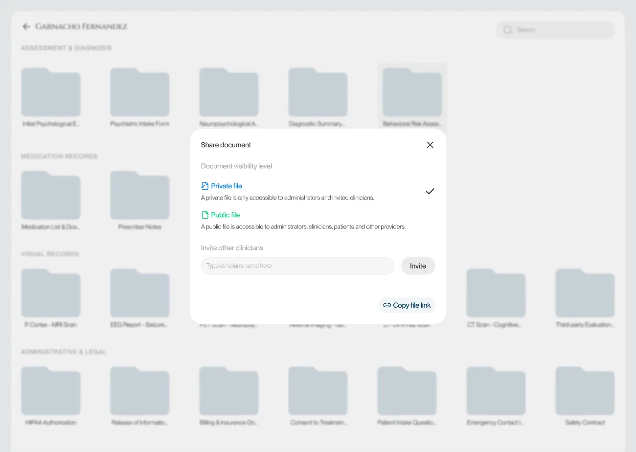
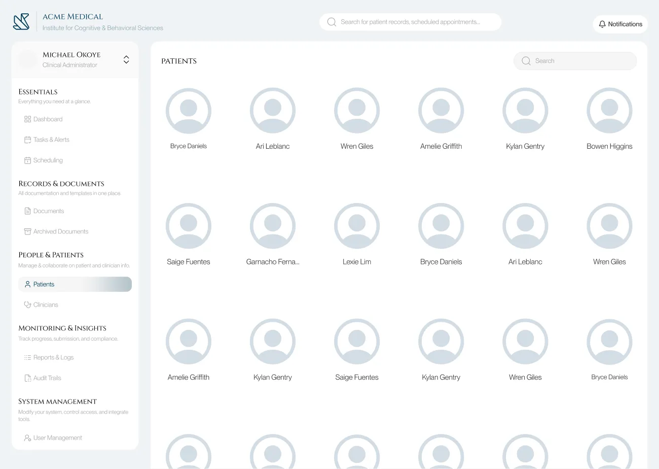


03. High-fidelity designs

02. The previous & improved versions of the nav. bar
Redesigning Admin Workflows for a Behavioural Health Software
16th July, 2025
Overview
I worked with a developer to redesign the document management system for a mental health clinic. Using recorded CEO interviews and PRD files, I audited existing workflows, identified friction points across both staff and patient journeys, restructured the information architecture, and delivered high-fidelity prototypes with full developer hand-off specs.
The process here was the point: taking secondhand research, extracting structured design problems from it, and producing solutions a developer could actually build.
My goals going in:
Reduce the time and cognitive load required to retrieve patient documents and records.
Consolidate and simplify frequent admin workflows: patient logging, appointment scheduling, document management.
Modernize the interface to lower error rates and make new staff onboarding significantly faster.
01. Before and after shots of the Dashboard & Documents page
Problem Statement
The existing platform had a lot of complexity without poor structure. Based on the interview recordings and dev notes, I noticed four recurring failure patterns:
Document retrieval required exact keyword matches and was unnecessarily case sensitive. Without the functionality to stack filters, staff who didn't remember precise file names usually got stuck.
Core admin workflows (logging a patient, booking an appointment, retrieving a document) involved redundant steps and unintuitive screen hierarchies.
Inconsistent UI patterns across modules meant new staff had no reliable mental model to transfer between sections, extending onboarding time unnecessarily.
Poor information hierarchy produced frequent missed and duplicated actions, particularly in scheduling.
Framing The Challenge
I started by going through the interview recordings and PRDs systematically, not looking for surface complaints but for the underlying workflow UX that those complaints pointed to. The recurring frustrations fell into three clusters: slow and unreliable document retrieval, scheduling errors caused by insufficient conflict visibility, and inconsistent labelling that made the interface unlearnable across sessions.
From this, I defined two user types with distinct needs:
Admin Staff (power users): High task frequency, switching between modules constantly, need fast retrieval and minimal navigation overhead. For them, every extra click is a cognitive tax in an already high-load environment.
Patients (low-frequency users): Occasional access to their own records and appointments, low technical literacy. The interface needs to feel like a consumer product, not a clinical database.
These two profiles pulled in different directions on almost every design decision. That tension became the central constraint I designed against throughout the project.
Exploring Possibilities
Before starting on the UI design I ideated solutions for the user experience failure points.
Document Retrieval: The keyword-only search was the biggest pain point for admin staff. I explored two design directions: a natural language search bar (staff would use queries like "Find Ngozi's consent form from July") and a conventional structured multi-filter system (file type, date range, visibility setting, patient name).
Natural language search was the more ambitious option and the one I designed and prototyped first. In evaluation with the developer it failed on two fronts:
Firstly it required complex backend logic and the staffs overall trust in search results could be fragile. Ultimately it was a low trust, over-engineered solution for an internal too, so I replaced it with the multi-filter search., it was faster to implement, predictable in behaviour, and directly matched to how staff actually thought about files.
Ontop of this, fuzzy search was also added so that users could input parts of the file name and still get relevant results, case sensitivity for inputs was also removed, this ended up improving the fault tolerances for staff queries.
Navigation Architecture: I initially designed a collapsible sidebar to maximise screen real estate for the data-heavy interface02. During testing, the developer's input clarified something important: staff use the sidebar as a spatial anchor while switching between nav options. Collapsing it forced them to re-expand and reorient on every switch, which added friction. I kept the sidebar permanently visible but redesigned it with clearer iconography, related sections grouping, and an intuitive hierarchy.
I also thought about implementing breadcrumbs as a middle ground, but edge cases in the deeper document flows made them unreliable as an anchoring method.
Patient-Facing UI: I replaced complex clinical words in document labels with plain-language equivalents and added short contextual summaries. I added mobile access for patient records. Calendar sync was improved to notify the user of scheduling conflicts proactively rather than allowing double-bookings to happen silently.
02. The previous & improved versions of the nav. bar
Build
With the structural decisions settled, I built high-fidelity screens covering both user journeys.
03. High-fidelity designs
Stress Test & Refinement
The developer and I both tested out the improved interface, testing against the actual workflow bottlenecks the CEO had flagged.
Three specific improvments added after the test.
Improved Search Results Listing: The initial layout grouped results by recency rather than category. During the walkthrough it became clear that staff searching for a document type (a consent form, a therapy note) needed category grouping as the primary axis, not time.
Keyboard Shortcuts: Added for the highest-frequency actions across the admin workflow. In a tool used 6-8 hours a day, removing hand-to-mouse transitions compounds into real time savings.
Shortened File Navigation Flow: The original flow required 4 clicks to reach a specific patient document from the dashboard. Restructured to 2 clicks by surfacing the document library directly from the patient profile card.
Outcome
The redesign was validated through developer walkthroughs against the CEO's documented pain points. The core retrieval and scheduling problems were addressed at the structural level, and the developer confirmed the handoff specifications were implementation-ready.
Specific outcomes from the improved redesign.
Document retrieval improved from an exact-keyword dependency to a multi-filter system useable without prior file knowledge.
Patient file access reduced from 4 clicks to 2 from the dashboard.
Scheduling conflicts surfaced proactively through overlap alerts, eliminating the silent double-booking failure mode.
New staff onboarding friction reduced through consistent navigation patterns and predictable module structure.
This project was not deployed. What it demonstrates is my ability to extract structured design problems from qualitative research, make and justify tradeoffs under real constraints, and deliver developer-friendly designs, prototypes and specifications.