Designing for Teachers: A SaaS Platform for Smarter School Management
10th November, 2025
Overview
I was responsible for the teacher-facing experience: the dashboards, tools, and flows that support daily classroom management, creation of assessments & their grading, and communication. The platform was built from zero, no existing UI, no design system, no visual foundation to start out with.
GradeX is a SaaS platform built to centralize school operations across teachers, students, parents, and administrators. The platform supports core functions such as attendance tracking, grading, communication, inventory requests, and staff workflows.
This case study documents how I designed a system capable of handling dense institutional data while remaining usable for teachers with no technical background, across 50+ screens, two distinct teacher roles, and a six-month production cycle.
The project started with a dense PRD from the product owner. It covered the major functional requirements they requested; multiple dashboards, digital grading tools, lesson management, inventory requests, and leave applications.
To get grounded, we ran a competitive analysis of platforms like Schoology, Alma, and Edmodo. We looked for patterns, what worked, and what didn’t. Common issues stood out quickly: cluttered dashboards, subpar navigation, and interfaces that assumed too much technical literacy from users who were classroom teachers first.
Using those insights paired with the stakeholder documentation, I mapped out two key personas for the teacher-facing side:
Main Teachers: Full access to dashboards, grading tools, analytics, and administrative features.
Substitute Teachers: A toned-down experience focused on attendance and lesson schedules.
The central constraint the two profiles created: because it was an enterprise tool for schools the platform had to be completely capable across its entire feature set without ever feeling like a burden on someone whose actual job was teaching, not navigating software.
Observation & Problem Statement
Frame The Challenge
The core issue with designing such a platform was balance. The product owner wanted depth, data density and comprehensive feature coverage, and the teachers needed clarity, speed, and minimal cognitive overload as possible. I needed to find a way to balance the end-users needs with that of the employer.
The four major questions my solutions were centred around:
Dashboard Density: How do you show large amounts of information without overwhelming users who are already context-switching between thirty students?
Information Hierarchy: What does a teacher need to see immediately versus what can sit one level deeper?
Functional Parity: How do you maintain consistent flows & navigation patterns across roles with meaningfully different permission sets, without making any experience feel like a degraded version of the other?
Scalability: How do you ensure every layout decision holds across desktop, tablet, and mobile?
Exploring Possibilities
With the constraints defined, I structured ideation around three pillars that directly addressed the failure modes identified in the competitive analysis.
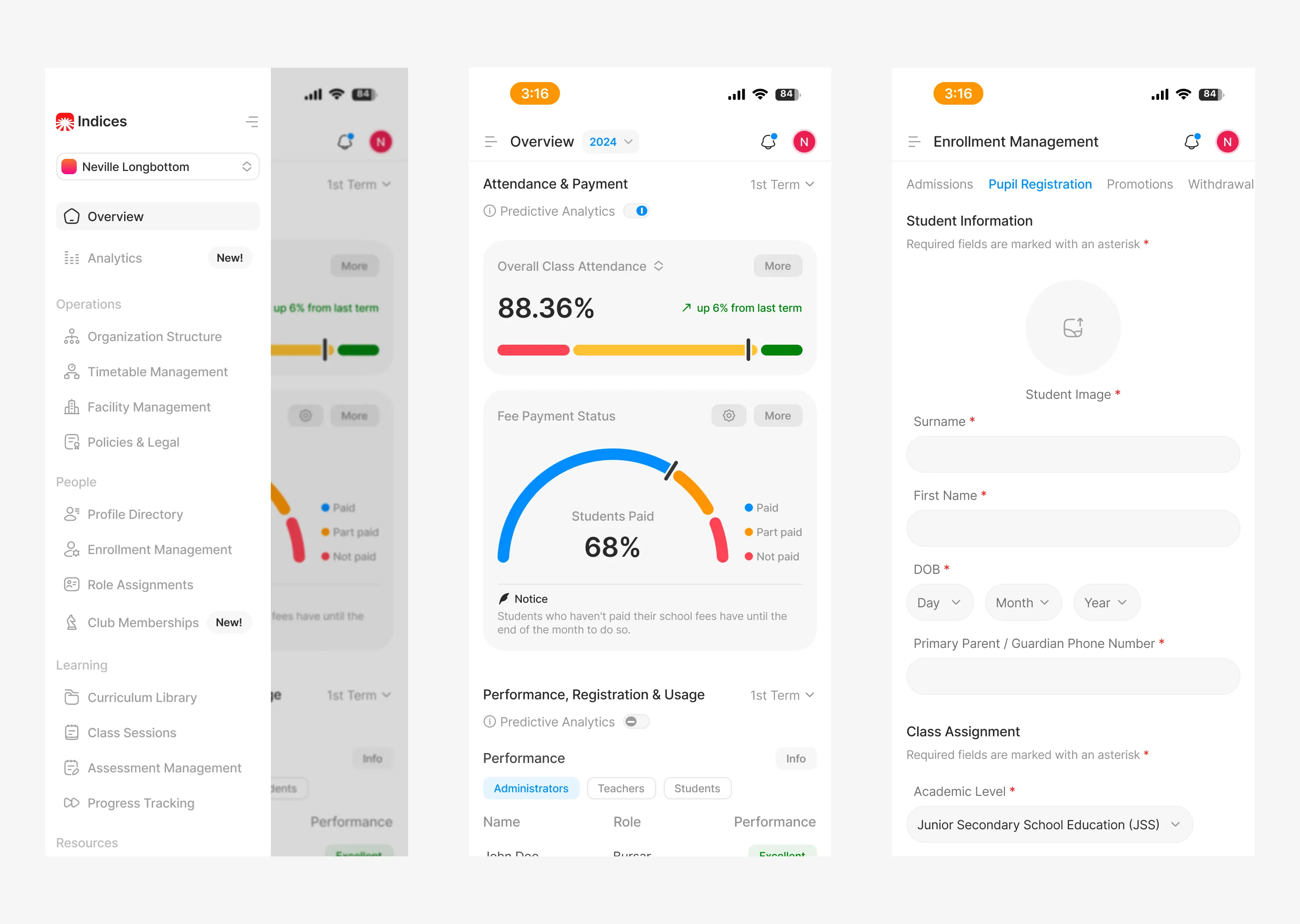
Information Architecture: The teacher module alone covered 50+ unique screens. I grouped related tasks to eliminate redundancy and applied progressive disclosure throughout: critical dashboards surfaced attendance, active lessons, and performance trends at a glance, with deeper analytics one click away. Dashboard cards functioned as quick-view summaries, giving teachers access to the information they needed without requiring them to navigate into full detail views for routine checks.
Intentional UX Writing: Most teachers on the platform had no technical background. Every label, prompt, error state, and microcopy string was, sometimes with the help of AI models written to guide rather than instruct, plain language was used throughout. Error states in particular were designed to tell users what happened and what to do next, not just flag that something went wrong.
Cross-Sectional Consistency: Since different designers handled different user roles across the platform. Consistency across all sections was important: a teacher navigating into a shared flow couldn't hit a section that felt like a different product.
We built a lightweight internal design system to align on layout grids, spacing, and interaction logic, and ran weekly syncs to catch divergence before it compounded. The result was a platform where every section, regardless of who designed it, behaved like part of the same product family.
Stress Test & Refinement
After completing the teacher-facing high-fidelity designs, the full team conducted remote moderated usability tests with teachers, substitute teachers, students, parents, and administrators across 20+ schools. Tests were structured around real workflows: marking attendance, submitting assignments, approving leave, managing supplies, and tracking lessons.
The overall response was strong. Teachers found the dashboards clear and navigable. One consistent issue emerged: fatigue when scanning dense data tables during extended sessions. Three targeted fixes addressed it:
Alternating row colours to create visual separation without adding structural weight.
Increased vertical spacing to reduce the compressed feeling in high-density views.
A Quick Actions panel surfaced at the dashboard level to cut the click depth on the five most frequent teacher tasks.
These refinements were added into the design system and implemented collaboratively with developers to maintain accuracy during hand-off.
Build
With ideation settled, I built high-fidelity prototypes covering the full teacher-facing experience across 50+ screens and both teacher roles.
The core components included:
Home Dashboard: Unified view of today's attendance, active lessons, and student analytics, structured to answer a teacher's first three questions of the day without any navigation.
Class Management: Student lists, grading tools, and performance insights in a single consolidated view, reducing the context switches required to move between related tasks.
Assignments & Exams: Setup, submission tracking, and review tools for coursework, with clear state indicators so teachers always knew what required action.
Inventory Requests: Streamlined supply request flow, two steps from dashboard to submission.
Leave Applications: A clean request and approval flow designed for infrequent use, meaning it had to be self-explanatory on first contact without onboarding.
All designs were responsive. Layouts adapted to breakpoint based on content priority, not by collapsing desktop layouts vertically onto mobile.
Results
GradeX completed its six-month development cycle and launched successfully. Usability testing across 20+ schools produced a ~95% satisfaction score. Teachers across the pilot cohort found the dashboards clear and intuitive, and the core workflows, attendance, grading, lesson tracking, performed without significant friction in moderated testing.
The three specific refinements from stress testing (row colours, spacing, Quick Actions panel) were validated in follow-up test rounds before handoff, confirming the changes resolved the table fatigue issue without introducing new navigation complexity.
The teacher-facing experience shipped production-ready, with a complete developer handoff file covering component specs, interaction states, and responsive behaviour documentation.
Art Direction Revisit
The designs above reflect what shipped. Art direction on this project was owned by the lead designer, and my role was to execute the teacher-facing experience within that visual framework.
The screens below are my own aesthetic revisit of the admin module, the most data-dense section of the platform. I chose the admin section rather than my own module because I believe complex data hierarchies are where visual judgment under constraint is most visible. The underlying UX decisions and information architecture remain consistent with the shipped product. What changed is the visual language, spacing system, typography treatment, and component aesthetic, brought in line with my own standards.
This is not a critique of the shipped product. It's a demonstration of what I'd bring to a project where I owned the full design direction.


02. My redesign of some key interfaces


01. High-fidelity designs

Designing for Teachers: A SaaS Platform for Smarter School Management
10th November, 2025
Overview
GradeX is a SaaS platform built to centralize school operations across teachers, students, parents, and administrators. The platform supports core functions such as attendance tracking, grading, communication, inventory requests, and staff workflows.
I was responsible for the teacher-facing experience: the dashboards, tools, and flows that support daily classroom management, creation of assessments & their grading, and communication. The platform was built from zero, no existing UI, no design system, no visual foundation to start out with.
This case study documents how I designed a system capable of handling dense institutional data while remaining usable for teachers with no technical background, across 50+ screens, two distinct teacher roles, and a six-month production cycle.
Observation & Problem Statement
The project started with a dense PRD from the product owner. It covered the major functional requirements they requested; multiple dashboards, digital grading tools, lesson management, inventory requests, and leave applications.
To get grounded, we ran a competitive analysis of platforms like Schoology, Alma, and Edmodo. We looked for patterns, what worked, and what didn’t. Common issues stood out quickly: cluttered dashboards, subpar navigation, and interfaces that assumed too much technical literacy from users who were classroom teachers first.
Using those insights paired with the stakeholder documentation, I mapped out two key personas for the teacher-facing side:
Main Teachers: Full access to dashboards, grading tools, analytics, and administrative features.
Substitute Teachers: A toned-down experience focused on attendance and lesson schedules.
The central constraint the two profiles created: because it was an enterprise tool for schools the platform had to be completely capable across its entire feature set without ever feeling like a burden on someone whose actual job was teaching, not navigating software.
Frame The Challenge
The core issue with designing such a platform was balance. The product owner wanted depth, data density and comprehensive feature coverage, and the teachers needed clarity, speed, and minimal cognitive overload as possible. I needed to find a way to balance the end-users needs with that of the employer.
The four major questions my solutions were centred around:
Dashboard Density: How do you show large amounts of information without overwhelming users who are already context-switching between thirty students?
Information Hierarchy: What does a teacher need to see immediately versus what can sit one level deeper?
Functional Parity: How do you maintain consistent flows & navigation patterns across roles with meaningfully different permission sets, without making any experience feel like a degraded version of the other?
Scalability: How do you ensure every layout decision holds across desktop, tablet, and mobile?
Exploring Possibilities
With the constraints defined, I structured ideation around three pillars that directly addressed the failure modes identified in the competitive analysis.
Information Architecture: The teacher module alone covered 50+ unique screens. I grouped related tasks to eliminate redundancy and applied progressive disclosure throughout: critical dashboards surfaced attendance, active lessons, and performance trends at a glance, with deeper analytics one click away. Dashboard cards functioned as quick-view summaries, giving teachers access to the information they needed without requiring them to navigate into full detail views for routine checks.
Intentional UX Writing: Most teachers on the platform had no technical background. Every label, prompt, error state, and microcopy string was, sometimes with the help of AI models written to guide rather than instruct, plain language was used throughout. Error states in particular were designed to tell users what happened and what to do next, not just flag that something went wrong.
Cross-Sectional Consistency: Since different designers handled different user roles across the platform. Consistency across all sections was important: a teacher navigating into a shared flow couldn't hit a section that felt like a different product.
We built a lightweight internal design system to align on layout grids, spacing, and interaction logic, and ran weekly syncs to catch divergence before it compounded. The result was a platform where every section, regardless of who designed it, behaved like part of the same product family.
Build
With ideation settled, I built high-fidelity prototypes covering the full teacher-facing experience across 50+ screens and both teacher roles.
The core components included:
Home Dashboard: Unified view of today's attendance, active lessons, and student analytics, structured to answer a teacher's first three questions of the day without any navigation.
Class Management: Student lists, grading tools, and performance insights in a single consolidated view, reducing the context switches required to move between related tasks.
Assignments & Exams: Setup, submission tracking, and review tools for coursework, with clear state indicators so teachers always knew what required action.
Inventory Requests: Streamlined supply request flow, two steps from dashboard to submission.
Leave Applications: A clean request and approval flow designed for infrequent use, meaning it had to be self-explanatory on first contact without onboarding.
All designs were responsive. Layouts adapted to breakpoint based on content priority, not by collapsing desktop layouts vertically onto mobile.
01. High-fidelity designs
Stress Test & Refinement
After completing the teacher-facing high-fidelity designs, the full team conducted remote moderated usability tests with teachers, substitute teachers, students, parents, and administrators across 20+ schools. Tests were structured around real workflows: marking attendance, submitting assignments, approving leave, managing supplies, and tracking lessons.
The overall response was strong. Teachers found the dashboards clear and navigable. One consistent issue emerged: fatigue when scanning dense data tables during extended sessions. Three targeted fixes addressed it:
Alternating row colours to create visual separation without adding structural weight.
Increased vertical spacing to reduce the compressed feeling in high-density views.
A Quick Actions panel surfaced at the dashboard level to cut the click depth on the five most frequent teacher tasks.
These refinements were added into the design system and implemented collaboratively with developers to maintain accuracy during hand-off.
Results
GradeX completed its six-month development cycle and launched successfully. Usability testing across 20+ schools produced a ~95% satisfaction score. Teachers across the pilot cohort found the dashboards clear and intuitive, and the core workflows, attendance, grading, lesson tracking, performed without significant friction in moderated testing.
The three specific refinements from stress testing (row colours, spacing, Quick Actions panel) were validated in follow-up test rounds before handoff, confirming the changes resolved the table fatigue issue without introducing new navigation complexity.
The teacher-facing experience shipped production-ready, with a complete developer handoff file covering component specs, interaction states, and responsive behaviour documentation.
Art Direction Revisit
The designs above reflect what shipped. Art direction on this project was owned by the lead designer, and my role was to execute the teacher-facing experience within that visual framework.
The screens below are my own aesthetic revisit of the admin module, the most data-dense section of the platform. I chose the admin section rather than my own module because I believe complex data hierarchies are where visual judgment under constraint is most visible. The underlying UX decisions and information architecture remain consistent with the shipped product. What changed is the visual language, spacing system, typography treatment, and component aesthetic, brought in line with my own standards.
This is not a critique of the shipped product. It's a demonstration of what I'd bring to a project where I owned the full design direction.
02. My redesign of some key interfaces